
Tuesday 31 January 2012
Hand-drawn logo

I have hand drawn my logo however I have added the logo name onto to the logo via adobe photoshop.

Chocoholics Swing Tag

Here is my swing tag I have produced. I have drawn the image by hand however added the name "Chocoholics" using adobe illustrator.
Final Packaging


This is my final packaging I have completed. Firstly I have produced a star shape on adobe illustrator. Then I added a bold colour of red with decent shaped polka dots as it refers to a strawberry.Finally I printed it and joined up the edges of the shape together in order to create my package. However I have made the green leaves on top of my packaging by hand, in addition to this I inserted some green tissue paper into the packaging.


Thursday 26 January 2012
Hand-drawn swing tags

Here are some swing tag designs I have drawn and colours using felt tip pens.
I enjoyed this as it was very interesting experimenting with different designs with the same colours.
Examples of swing tags


Experimenting of illustrations using Adobe Illustrator.

Here are a couple of illustration designs I experimented with using Adobe Illustrator.
cross stich logo


Using adobe illustrator I created a cross stitch logo
The first image is the accurate cross stitch logo I experimented with, however the second image is not very accurate.


Packaging net examples

Here are a few net designs I experimented with. I have experimented with these in order to come up with an initial idea and to improve my construction skills. In my opinion the triangle and square net were easy to construct however the carrier bag net was a little more difficult to put together. In contrast to this the package that I like the most was the carrier bag, and the least I liked was the square as it is very basic and less interesting.
Tuesday 24 January 2012
Logo analysis
THORNTONS- The logo is contrasting with chocolate, such as the font and the colours used.

HOTEL CHOCOLAT- The word “Chocolat” is written in a font which relates to chocolate as it sort of looks dripped. However it is designed in black and white which does not contrast with chocolate, although the logo seems very posh.

CADBURY- The swirly pattern behind the word seems like chocolate that looks mixed with the word “Cadbury”, however the colours do not relate with chocolate.
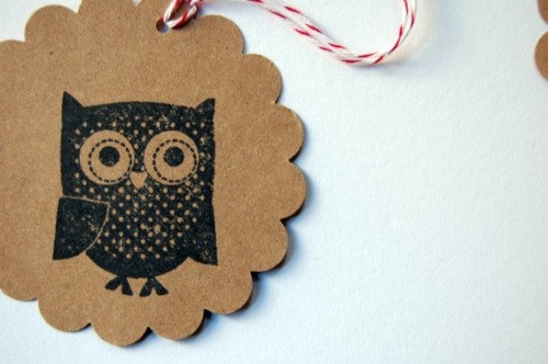
Chocolate Packaging Ideas

Here is an image of a packaging idea I came across while re-searching.
In addition to building up on ideas I am planning to use a similar net design however I will be using similar colours with different details.
New Years Resolutions
My new years resolutions:
-Keep up on deadlines
-Upload work on blog regularly
-Concentrate in lesson
-Keep up on deadlines
-Upload work on blog regularly
-Concentrate in lesson
AS Graphics Mindmap

Here is a mind map we have produced as a group in order to illustrate and gather our ideas together.

Subscribe to:
Posts (Atom)